No matter how you shake it colour grading isn’t something you’re going to learn overnight. I’m still learning more and more all the time. It’s one of those things where most people will only ever continue to improve and only a select few will ever master. You could compare it to sound mixing but even that is a fairly loose comparison. There are a couple of fairly definite dos and don’t but beyond that it’s whatever you creatively want to make it. But I have a certain number of set processes and a workflow that if you practice should set you on the right path.
What is colour grading?
Colour grading is a bit like mixing music after a recording. You’ve recorded all the material and now you need to present it at its best as per your creative intention. There are three main steps to my colour grading process and they are…
- Contrast: Ensure shadows are correctly dark, highlights are correctly bright and there is the right balance between the two
- Colour Correction/Balance: Check that all your colours are correct e.g black is black, white is white and skin is ‘blood colour’
- Saturation Control: Set how colourful you want your colours to be
- Final Look: This is where you add final touches and creative tweaks such as LUTs
Different editing systems vary but they all generally offer some kind of option to apply effects as an affecting layer rather than applying clips to each individual clip. In Final Cut Pro I use adjustment layers that I layer above my footage as per the four processes I described above. I also assign them to a colour-grading video role which enables me to turn them all on and off in one click. This speeds up workflow massively. If you’re an absolute beginner to this then what I’ve described so far is enough to get you off the starting block. But do read on as we delve deeper.
Scopes
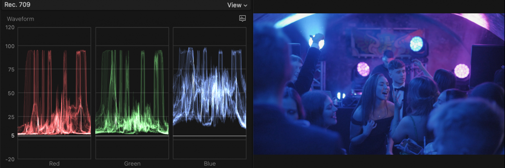
Your eyes are absolutely incredible pieces of biotechnology. Perfectly stabilised, auto-exposure, autofocus cameras with the ultimate resolution. However, eyes can’t see everything and eyes can play tricks on us. For example, if you sit in a green light for a long time, after a while your eyes get used to it until you don’t notice the green anymore. The same can happen when grading, which is why we use scopes to ensure what the think we see is what we are actually seeing. Scopes take all the light and colour information in a frame and present it in a way in which it can be measured. The main scopes I use are RGB Parade and vectorscope.
RGB Parade shows your image split up into red green and blue channels with the vertical scale showing you how bright the image is. The bottom 0 value is the floor limit of what can be displayed, below this point, you will just lose shadow data (clipping). Likewise, 100 is the brightness ceiling and above this, you will lose highlight data (clipping), referred to as ‘blowout’. An RGB parade tells us where there is information, at which level of brightness and in which of the 3 main colours.
To achieve neutral footage you generally need all three channels balanced. The simplest thing to do is obviously try to match the highlight/shadow limits by making each channel equally tall and in line. But data in the mid-range may also need balance. This is not a hard and fast rule. If an image has bright blue lights all over it (as below) then the blue channel will naturally display more information compared to the others so always use your eyes, just as you would always use your ears to mix sound and not just rely on graphic EQs.
Vectorscope shows you the image as a circle with the saturation of each colour spanning out from the centre. At the very centre is zero saturation where everything is either pure black or pure white. As it spans out the saturation increases. A vectorscope shows us how magenta or lime etc.. an image is. It also tells us if our skin tones are correct. The line that extends from the centre towards red at roughly 11 o’clock on the dial is called the skin tone line, though I call it the bloodline as what it is showing us is blood underneath human skin. Generally speaking, most people’s skin should line up with this line. The vectorscope is very complementary to working with colour wheels as any adjustments translate exactly.

One unsung hero, which isn’t necessarily a scope, is the luma and saturation checkers. If you turn them on it will give you zebras wherever your image is blowing out or oversaturated. It’s pretty much the same deal as the zebras on your camera. I use them constantly as it saves you from having to check a scope when the zebra will show you directly what’s occurring in the actual frame.
Colour correction tools
I use 2 main colour correction tools. They are colour curves and colour wheels. However there is a third, which happens to be the default in Final Cut Pro (which you can change), and that is the colour board but I only really used that when I was starting out and don’t use it anymore as it just doesn’t offer the same degree of control you need to get the best results.
Colour Wheels show you all of your colours across the highs, mids and lows displayed as wheels. They are very simple and way more intuitive to use than curves as you simply push the puck in the direction of the colour you want to boost and voila. What is nice about colour wheels is that they pair perfectly with the vectorscope and so you have a direct reference to how you are affecting the colours – what you are adding and inadvertently reducing. For dialling in perfect whites, black and skin tones the colour wheels + the vectorscope are the killer combo. The negative about colour wheels is that you’re only controlling the colours around a preset divide between high, low and mid that you can’t control, so you don’t have the detailed control that you have with curves which span right across the spectrum.
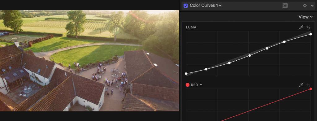
Colour Curves give you a set of diagonal lines. One controls luma (brightness) and the others control specific colours. The bottom left of the curve represents the shadows and the top right is the highlights. Colour curves give you the best control as you can make very specific alterations to specific tones and colours. Also, the total length of the curve relates directly to the 0-100 high of the RGB parade, so it makes it pretty easy to pick out an area you may want to adjust. Colour curves however can be a bit of a mind-bender for some aspects of colour correction as it’s that whole thing of “every action has an equal and opposite reaction”. For example, if you reduce the mid-tones of the red channel then you are inadvertently boosting the mid-tones in the green channel etc.. If you’re making tons of tweaks it can get a bit complicated and easy to get lost. There are also saturation curves which work in a similar way but affect only saturation.
1. Contrast
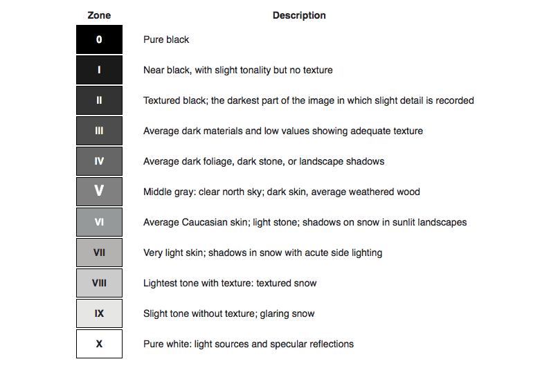
For setting contrast I use colour curves as they give you the most fine control. At the most basic level, you want the absolute shadows set to zero and absolute highlights set to 100. However, images do not always have absolute shadows and highlights. An unlit cave or a light bulb could give you absolute values of 0 and 100 respectively, however, black jeans and white paper might not be absolutes. So you need to adjust the exposure curve to place the various areas of tone where they belong. To figure this out we apply the Ansel Zone System (below) which gives us a reference as to how bright or dark certain things should be. You may have stylistic plans beyond this but at this stage, I think it’s best to simply prime your footage and get everything as correct and matching as it can possibly be and then play with looks at a later stage. Generally speaking, an s-curve is what I stick to as the s-curve shape translates well to a balance of light and dark with a bump in the upper and lower regions and the mid-section you play by eye. Generally speaking, the more steep the curve gets the harder the contrast gets.
PRO TIP: You can set your saturation to zero, turning off colour completely whilst setting contrast and then you will only be dealing with tonal information with nothing related to colour affecting your own perception or the readouts on the scopes e.g when an over-saturated colour appears to peak beyond 100 where in actual fact it’s the colour blowing out and not the brightness.
2. Colour Correction/Balance
If you’ve taken the steps described in the camera operation section then you should have set your camera up to record correct colours and you might even have a reference card in your footage to check. However, sometimes even that isn’t enough. The slightest difference between camera models, even of the same brands, can have colour differences. Between completely different cameras and colour profiles (e.g DSLR, GoPro, Phone) this can be exacerbated further. So quite often (i.e. pretty much always), you have to do some colour correction in post to ensure that a.) your colours match and b.) that they are as true as possible. There are three ways I approach this.
Auto White Balance Correction: All video editors will have some kind of magic wand feature where with one click corrects your colour. In Final Cut Pro you have the options of automatic where it tries to work it out itself, or white balance where you click the dropper on something in the image that is supposed to appear pure white and it uses that as a reference. This is where filming your reference card comes in very useful. One problem you sometimes face is – what is white? For example, if was holding a white reference card under a red light, for all intents and purposes that card will appear red so for me to suggest that it appears white would be false. But if you have a guy in a suit on screen, and he’s standing in a neutral light setting, then his white shirt should provide a fair reference point to click. Sometimes auto works fine and does prove helpful, but not always. So give it a spin and if it’s working then great, but if not we have other means.
RGB Parade Reference Correction: So going back to the RGB parade scope I mentioned before – this can be used as a reference to help you achieve neutral colours. Generally speaking in neutral footage the three channels of the RGB parade should appear to be balanced (i.e. all appear to be about the same size) with relative areas of information side by side. If they aren’t then there may be a colour cast. So for example, if the red channel appeared “taller” than the others and the image seemed a bit reddish, I would pull down the highlights of the red channel to bring it back into balance and review the image to see if it was producing a neutralising effect. As you get more familiar with reading curves you will get better at spotting issues. For example, if faces appear a little cold looking but the rest of the image is fine, then you might note a bunch of midrange information in the blue channel that’s out of balance with the other channels. Therefore, if you adjust the midrange of the blue channel colour curve then you should be able to correct that problem. RGB referencing is quite a nice way to approach colour as it strikes a nice natural interplay between your eyes, the curves and the scopes. It kinda feels a little more soft and organic. Nice. However, sometimes you’ll get some niggling little issue that requires a more surgical approach.
Vectorscope Reference Correction: So a vectorscope can tell us, officially, without question, what is pure white, pure black and skin tone. Paired with a colour wheel it’s simply a case of pushing the puck to where it should be in reference to the vectorscope. The only issue you have is separating out the skin tone information from the black reference zone information, from the white reference zone information. But there is a way. Simply apply a draw mask and mask out just an area of pure skin, or pure black or pure white, and then the vectorscope will only be showing you information on that specific area you have masked. To then neutralise the black or white, push the puck of the master colour wheel to where the black/white information appears directly centre in the vectorscope. You may need to then refine each a little bit using the highlight or shadow wheel respectively. For skin tones, you can adjust either the mid-tone wheel or the temperature slider until the skin information lines up with the bloodline on the vectorscope.
If you have no clear black, white or skin reference then just play it by eye. Always try to get a relative balance but sometimes things might just be a bit more pinky or orange etc.. As long as it works with the pro/proceeding shots then you’re good.
3. Saturation Control
Saturation is basically how colourful your colours are. Too colourful and your footage could come out like an eye-melting, nuclear, Bollywood nightmare but too desaturated and it may look dull and lack colour contrast. Also, it’s more of an old CRT television issue, but when stuff gets too bright or too saturated it can cause issues that would make a TV buzz. I think the Jackson 5 Show had issues like that. Creatively, you might want vivid colour or a desaturated look so bear that in mind, but generally speaking you want to see the colours you filmed and you want to see the balance and contrast between the colourful elements and the desaturated blacks and whites. You can play with looks at the end of the process.
Unlike standard footage (which is REC709), S-LOG footage compresses all of its data so you have to unpack it by giving a master boost before you even start making tweaks or using a utility LUT.
At the very basic level tweak to ensure that none of your colours are over-saturating. The saturation checker is the easiest way to see if you have an issue. If you have a red dress that’s blowing out, select that exact colour of red by clicking on it with the dropper tool and pull down the saturation until it balances out. Finally to ensure a balance I use the sat vs sat curve to make sure the most colourful stuff isn’t going nuts but in balance with the least colourful stuff.
4. Final Look
By this stage, your footage should look balanced and as colourful as you want it. The very last thing you do is give it a look in the same way you add a filter to an Instagram post. This helps to meld everything together under one ‘look’. To do this I first apply a LUT. LUT means “look-up table”, and it forces your image to fit a pre-designed colour palate. Some LUTs give a more warm look, some are cooler ect… There are an infinite amount of LUTs out there so try not to let them overwhelm you (although Ground Control have some good packs.). Having applied your LUT you will often find that it will limit your highlights and shadows and you may then want to apply additional saturation or colour controls after your LUT so that you can tweak the final look without going back and messing up your nice perfect balance that you’ve worked so hard to achieve.
5. Finish
And there you are. Export your project, give it a final review and be prepared to dive back in if need be to make any tweaks. Again, if you’ve followed this guide you’ll be using adjustment layers and maybe also a separate audio-post session so it will be much easier and faster for you to address any specific issue. I cannot stress enough, however – do not come this far only to stumble at the final fence.
Don’t beat yourself up if it isn’t perfect. Even blockbuster Hollywood films have issues with colour. If you’ve given it your best shot and done everything you can to make it as good as it could be then it’s probably gonna be a damn sight better than the project of someone who copped out and phoned it in, so well done you.
The final thing, going back to Part 1, is to make sure your project gets seen by the people who you want to see it. Don’t waste all this time, effort and expense just for your project to sit there on the shelf. This isn’t the dot com boom and people will not just watch your project simply because it exists. Deliver it to the world even if that means making phone calls, delivering flyers, booking ad space, entering it into film events etc… And then onto the next one.
So there is, my whopping 7 part introduction to video production and tbh I’m still not scratching the surface. It is a million individual processes and creative decisions which might be a bit much for some. Being a fully independent video producer takes a lot of learning, experience and hard work, which might not be for everyone. So if you need a little help please get in touch, I would be thrilled to talk to you about your ideas and project ambitions and explore what we can do.